
The report type you choose determines which records and fields appear in your report. For example, the Contacts report type gives you access to Contact records and fields like Name, Address, Telephone Number, etc.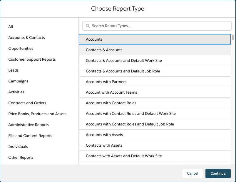
Once the Report Type has been selected. A report can use the tabular, summary, matrix, or joined format.
A Tabular Report are the simplest and fastest way to look at data. Similar to a spreadsheet, they consist simply of an ordered set of fields in columns, with each matching record listed in a row. Tabular reports are best for creating lists of records or a list with a single grand total. They can’t be used to create groups of data or charts, and can’t be used in dashboards unless rows are limited. Examples include contact mailing lists and activity reports.
A Summary Report are similar to tabular reports, but also allow users to group rows of data, view subtotals, and create charts. They can be used as the source report for dashboard components. Use this type for a report to show subtotals based on the value of a particular field or when you want to create a hierarchical list, such as all opportunities for your team, subtotaled by Stage and Owner. Summary reports with no groupings show as tabular reports on the report run page.
A Matrix Report are similar to summary reports but allow you to group and summarize data by both rows and columns. They can be used as the source report for dashboard components. Use this type for comparing related totals, especially if you have large amounts of data to summarize and you need to compare values in several different fields, or you want to look at data by date and by product, person, or geography. Matrix reports without at least one row and one column grouping show as summary reports on the report run page.
A Joined Report let you create multiple report blocks that provide different views of your data. Each block acts like a “sub-report,” with its own fields, columns, sorting, and filtering. A joined report can even contain data from different report types.
Joined reports are available only in Enterprise, Performance, Unlimited, and Developer Editions.
There are a couple of answers to this question:
1. The Scheduled Report will run based on the time-zone of the user who created the report.
2. The report will run within a 30 minute of the preferred start time i.e. preferred start is 12:30, depending on what is happening on the system it will arrive within a 30 min time frame either side of the preferred start time.
3. You need an HTML enabled email client to view the report.
Check that the “Allow Reports and Dashboards to Be Sent to Portal Users” setting is ticked as the picture below depicts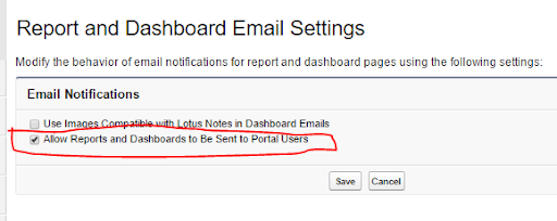
Check that the folder where the report or reports reside can be shared with the portal users (note that the Unified Public folder is shared with all users, internal and external so that folder is ideal for this purpose)
When setting up the schedule, select the ‘Customer Portal Users’ option from the search menu and then move the user or users who should receive the email with the report to the ‘Send Email To’ box.
To show or hide the chart, click pie symbol.
To edit the chart, click cog symbol within the chart.
From the chart editor, change chart type, give the chart a title, change axes, show or hide a reference line, and show or hide chart values.
Please note that you will need at least one grouping to create a chart
To fix this problem you can either:
1. Reactivate the user
2. Update the Schedule and change the running user
3. Delete the scheduled job. If the running user scheduled a report in his or her personal folder, you cannot edit this schedule; however , if you have “Modify All Data” permissions, you can delete the job from the All Scheduled Jobs page.